Big 5 Rebrand

Rebranding of the sporting goods company.

OVERVIEW

The Big 5 Sporting Goods rebrand focuses on modernizing the company’s identity while honoring its strong legacy in sports retail. The rebranding creates a cohesive, consistent identity across all touchpoints, from in-store signage to digital platforms.

APPROACH

The visual identity will combine modern, and sporty typography, while keeping Big 5's strong color palette, to create a modern and inclusive identity. The new logo represents the crosswalk and symbolizes for keep going forward that enhance the company's mission.

INDUSTRY

Business

PERSONALITY

Clean
Modern
Sporty

TYPOGRAPHY

Industry
Geist
Arvo

SERVICES

Branding

PROCESS
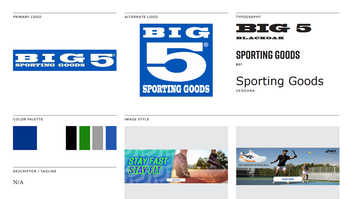
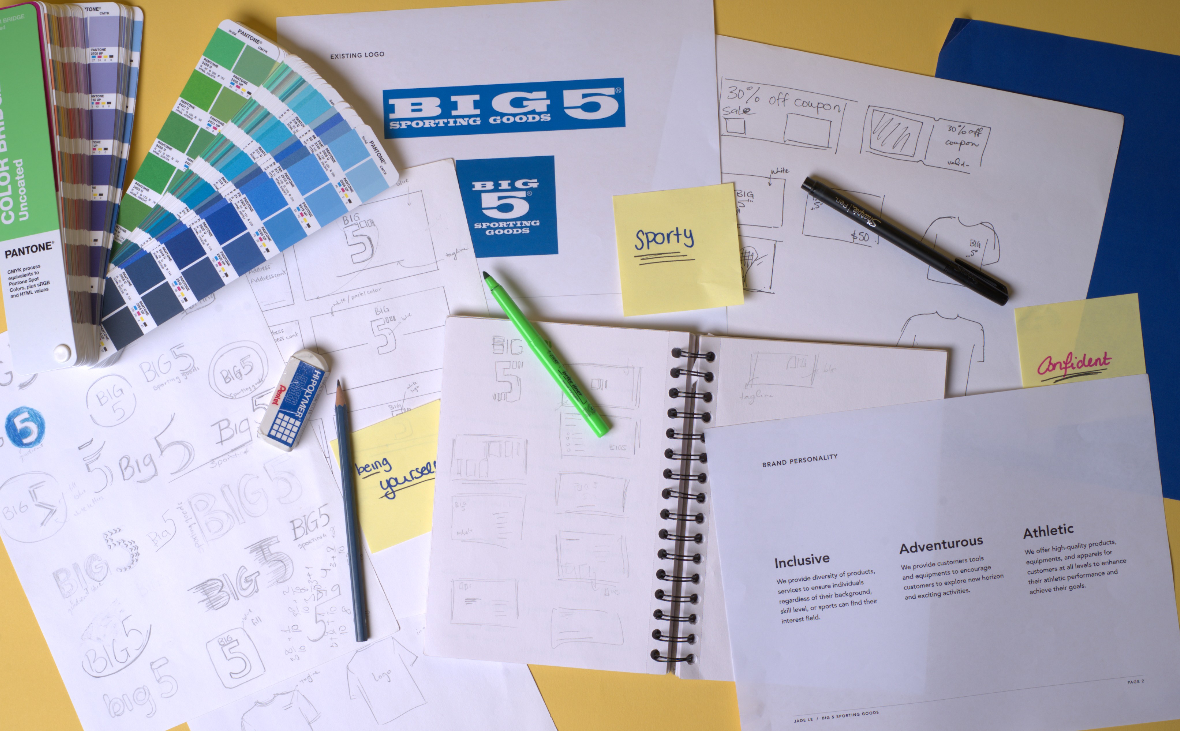
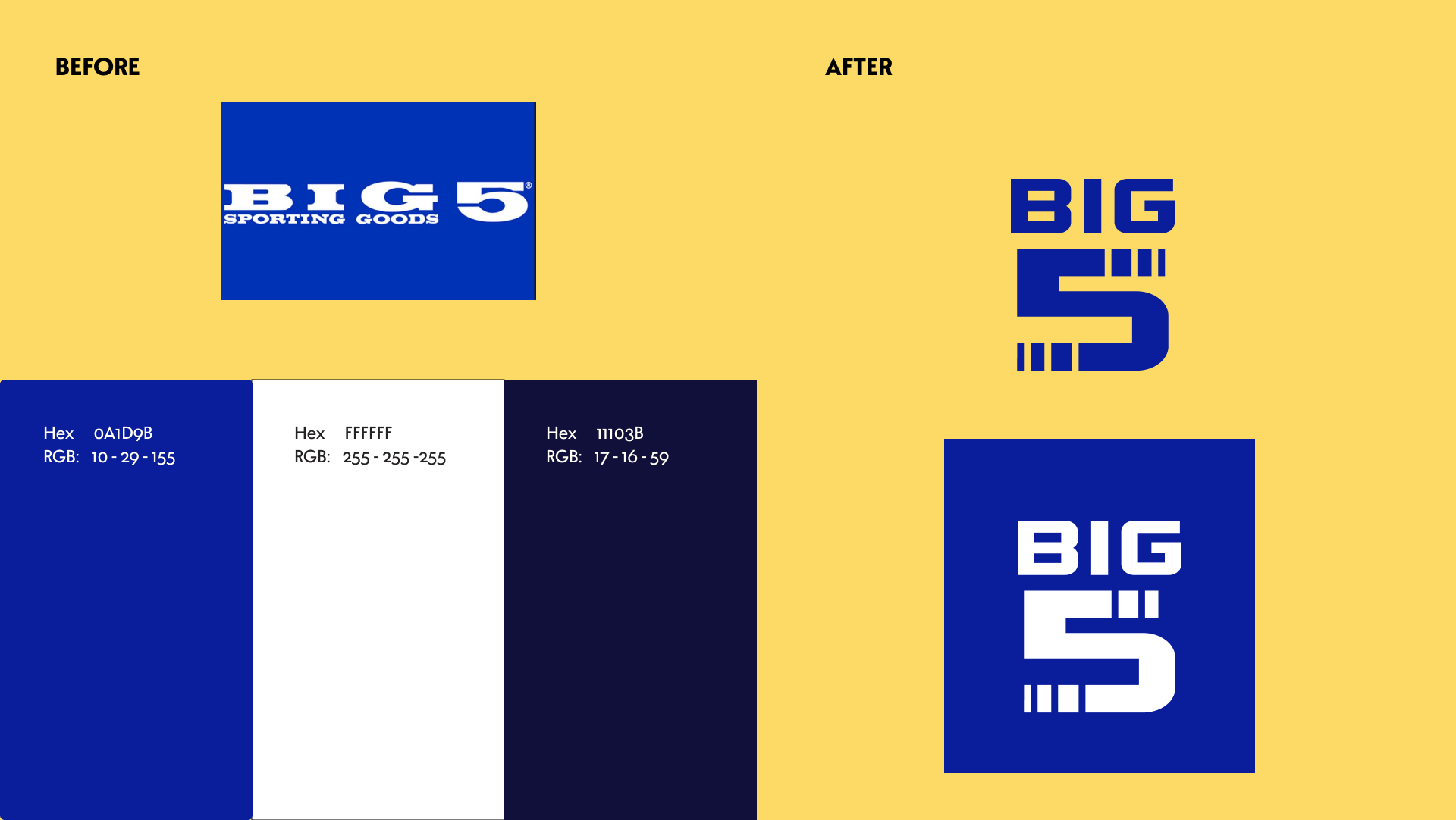
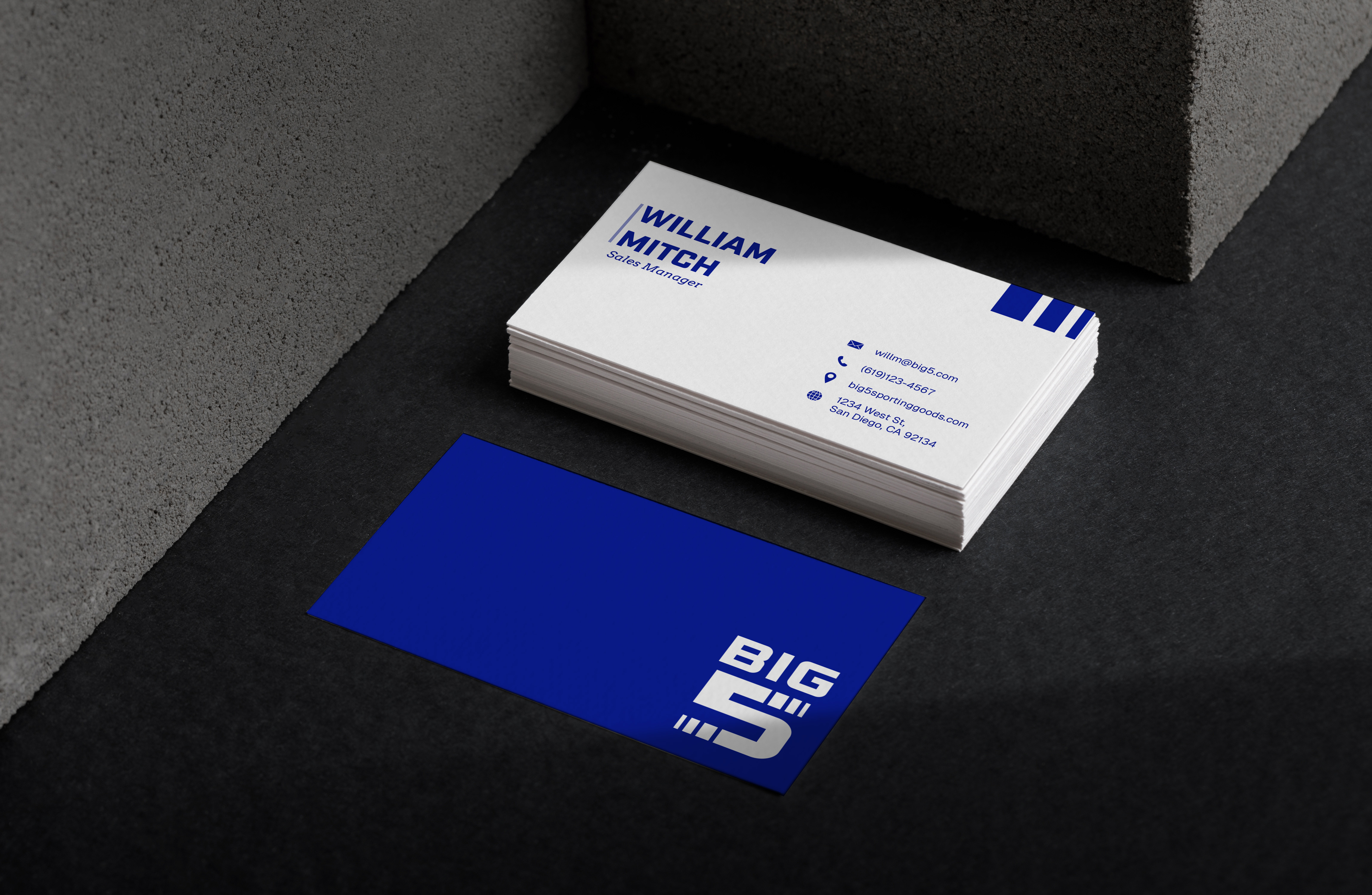
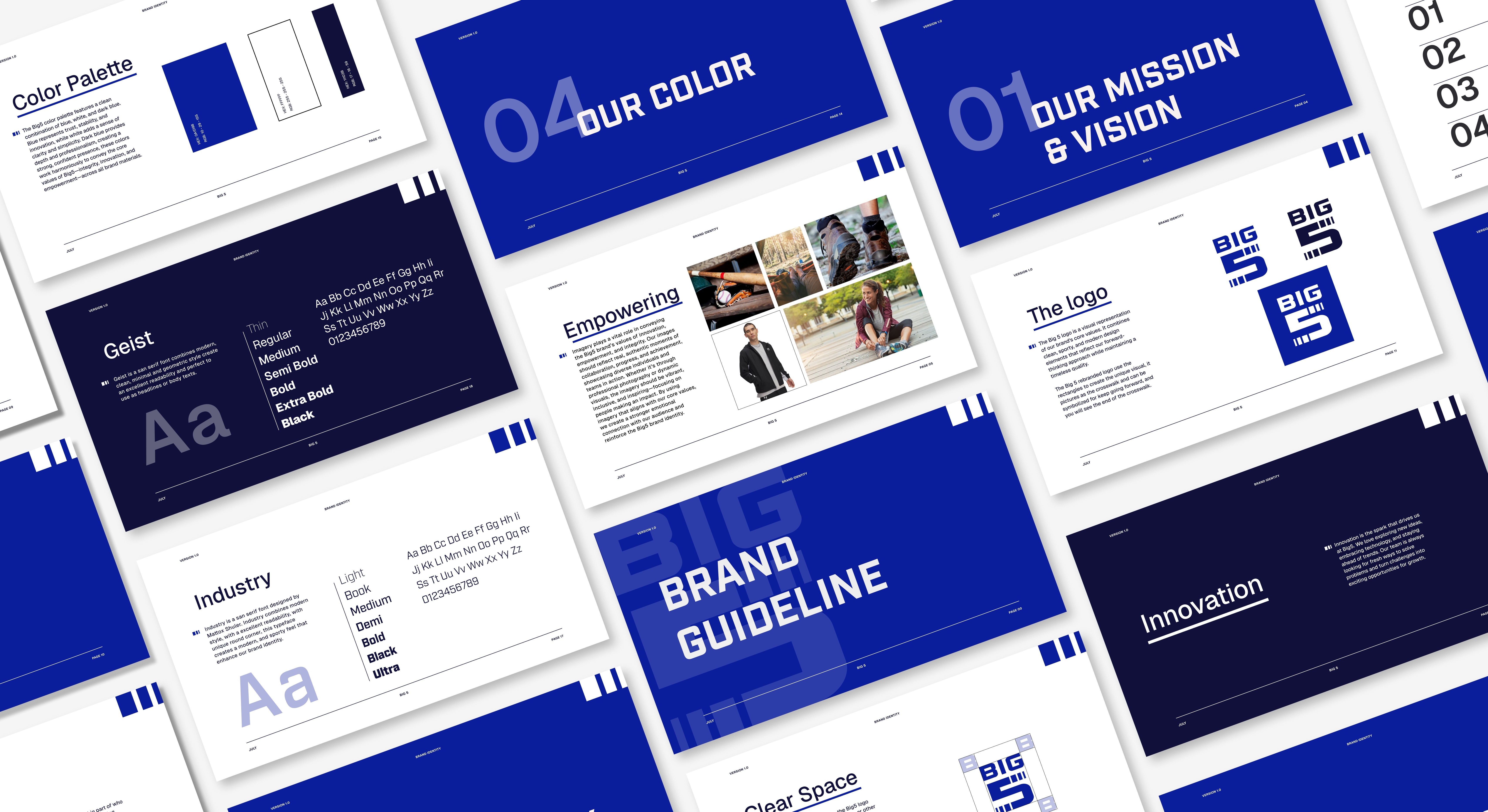
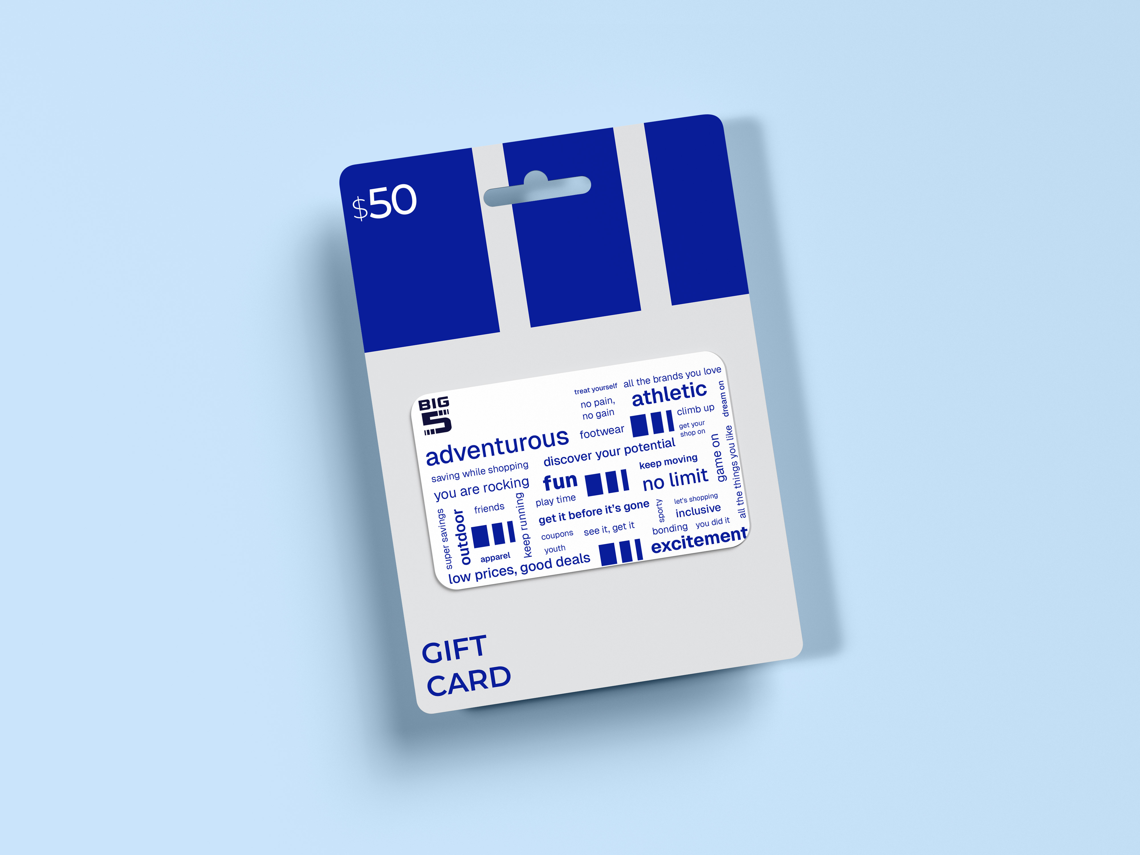
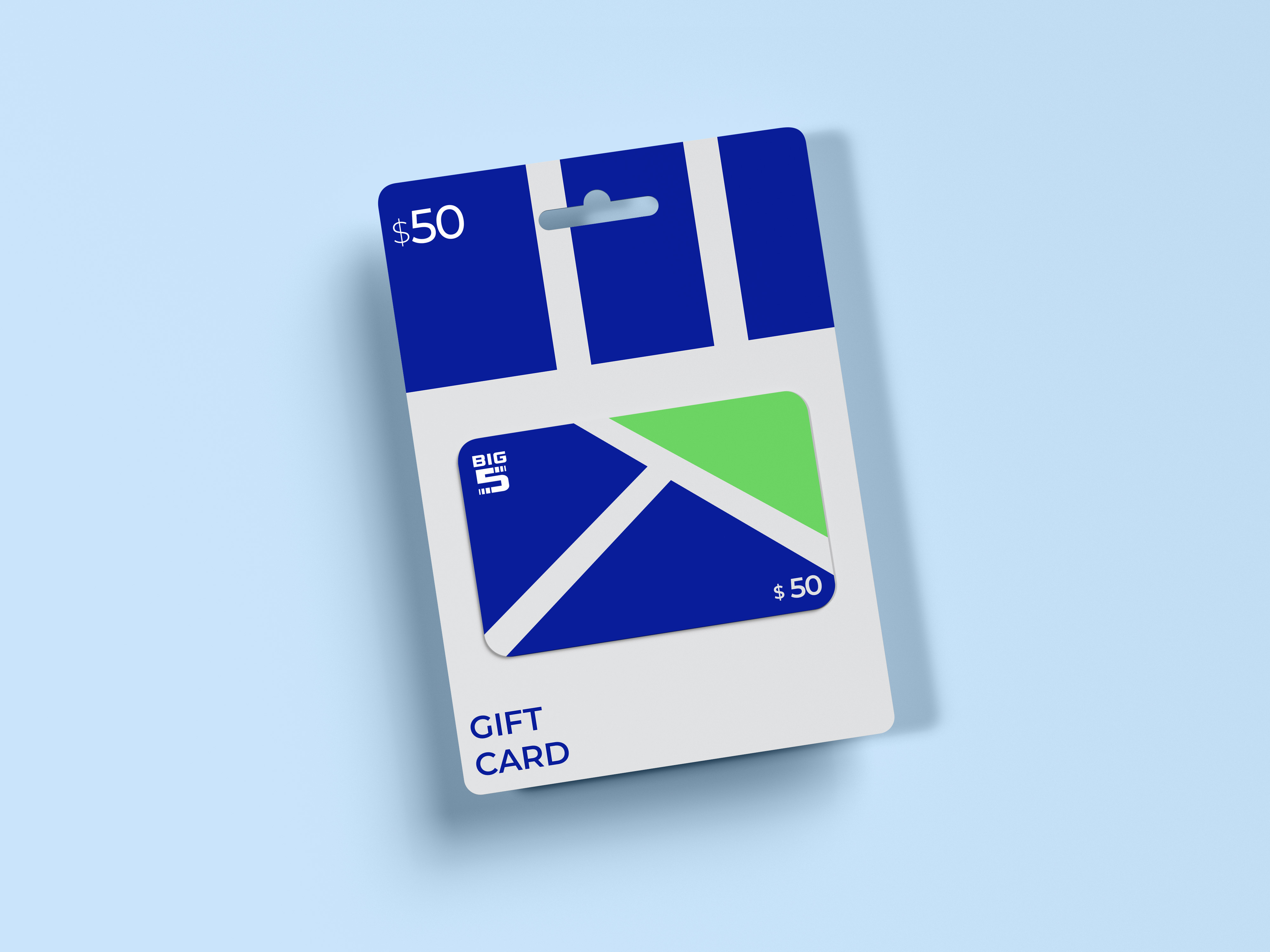
The current brand’s personality, packaging, values, and website have been studied in depth. The brand’s personality and primary color, blue, reflect a sporty character. The original logo uses a serif typeface, and multiple inconsistent versions have been created by extending the logo. To maintain the brand’s core identity while improving consistency, the logo has been modernized using a sans-serif typeface, keeping the signature blue hue to preserve its value.
Next Projects

Bittersweet

Branding
Packaging

Quantify

Branding
Page Layout